
From Cover to Cover's Favorite Comics of 2022
Scott and Mike take a look at their favorite comics from 2022.

Thank you for taking a few minutes to read what we thought were some exceptional offerings in the world of sequential art during 2022. We'd be remiss if we didn't issue the standard boilerplate caveats that this list is by no means conclusive or comprehensive. We choose the term "favorite" for specific reasons as the books that comprise this list rank highest in our own personal regard based on what we've read this year. By no means have we read everything, and by no means do we mean to offer any commentary by means of exclusion.
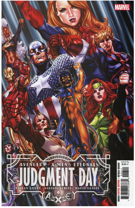
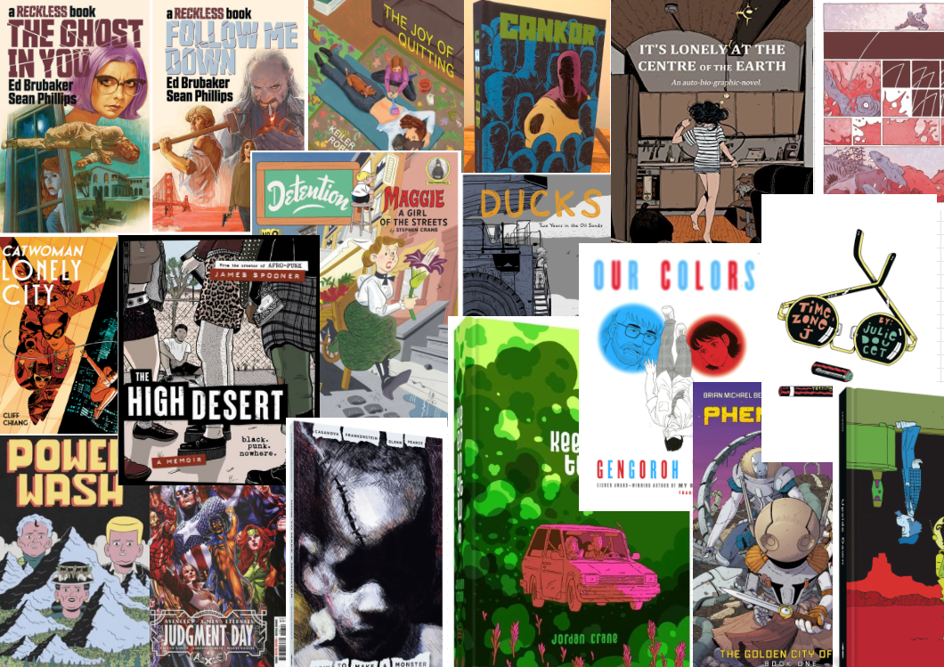
A.X.E.: Judgement Day by Kieron Gillen, Valerio Schiti, Al Ewing, and others, published by Marvel Comics (review of the lead-in issues)
I don’t know if Gillen’s story feels like a big event, even though that’s precisely what it is. The main, six-issue series tried to have the beats and the grandiosity of a mega event. Using a Celestial judging humanity to balance out a story of the Eternals/mutants conflict, this event leaned heavily on its crossover issues (particularly Immortal X-Men, X-Men Red and a number of Gillen-penned Eternal or character-focused tie-ins) to keep the story focused on the personal meaning of this judgment. And it all hung together far better than these types of sweeping crossovers tend to. And there’s so much to dig into in this story, so many rich layers and characters to build something that feels grand and weighty. (sc)
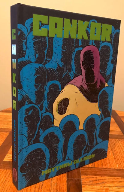
Cankor by Matthew Allison, (self-published)
Part autobio, part super-hero deconstruction, part takedown of the comics industry, Allison’s is a puzzle with no real clues about how it should fit together. And maybe the answer is just “Comics…” with a shoulder shrug. Allison riffs on the most cosmic and navel-gazing Marvel/DC comics while also trying to establish his indy credibility by citing Jim Woodring, Peter Bagge, and John Porcellino in this book that feels like it’s trying to exorcize many demons out of Allison’s brain. This is a book I can see returning to over and over again to try and pick out more of what Allison is trying to do here. (sc)
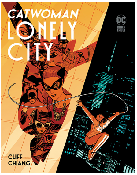
Catwoman: Lonely City by Cliff Chiang, published by DC Comics/Black Label
You knew going into this that it would be a fantastic-looking book. Chiang’s story, a Dark Knight Returns for Selina Kyle, also delivers a great story about living in and with the past, including the damage that it ultimately does. Returning to Gotham City after a 10-year stint in prison, Kyle finds a city playing its usual games even if the players have shifted where they’re sitting around the board. This story could lose itself in the past, but Chiang always keeps his characters focused on creating a future for themselves and the city. (sc)
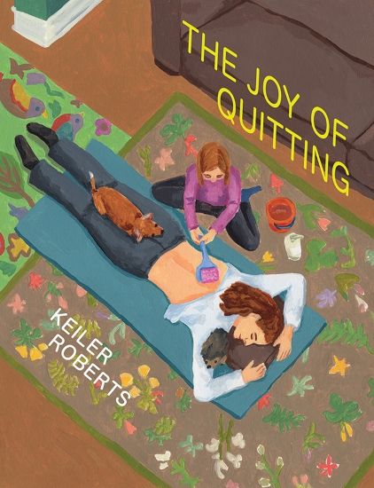
Creepy by Keiler Roberts and Lee Sensenbrenner, The Joy of Quitting by Keiler Roberts, both published by Drawn & Quarterly
Ok, so it's cheating right off the bat, and I know that. It took me forever to get to read The Joy of Quitting. Earlier this year, I fell in love with My Begging Chart, and I spent the rest of the year in eager anticipation of both The Joy of Quitting and Creepy. The latter isn't exactly a graphic novel or comic. It's fundamentally a children's book, sure. But it's still Keiler Roberts, and it's still published by D&Q, so it's fair game for me. Co-authored with her brother, Len Sensenbrenner, Creepy is a 21st-century morality tale for a generation consumed by screens. (I hope you're reading the From Cover to Cover print version). It carries with it a sense of whimsical precociousness as siblings Lee and Keiler conjure the mischievous nature of youth. The Joy of Quitting is everything I wanted it to be, and it might rank as Roberts' magnum opus when all is said and done. It's more comprehensive than My Begging Chart, both in the content and the style of art. Roberts doesn't eschew her wild inclinations, but The Joy of Quitting feels more like a reflection, whereas My Begging Chart felt like a reaction to events as they happen. Roberts brings the same wry wit that allows her to subtly lampoon everyday events by undermining the kind of attention and importance we assign to the temporary incidents of daily life. (mmc)
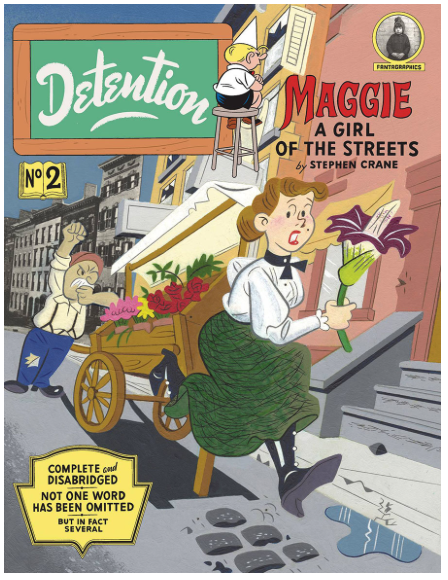
Detention #2 by Tim Hensley, published by Fantagraphics Books
Honestly, I’m still trying to wrap my head around this one– an adaptation of Stephen Crane’s Maggie: A Girl of the Streets done in the style of an old Little Rascals comic. Hensley takes the language of street urchin comics and applies it to this classic story of a woman’s journey to be something more than just what her family is. Or what they think they should be. The characters often look like something out of an old E.C. Segar Popeye strip, which keeps the tone of this comic light even as Crane’s weighty story shows this breakdown of people in the late 19th/early 20th century.
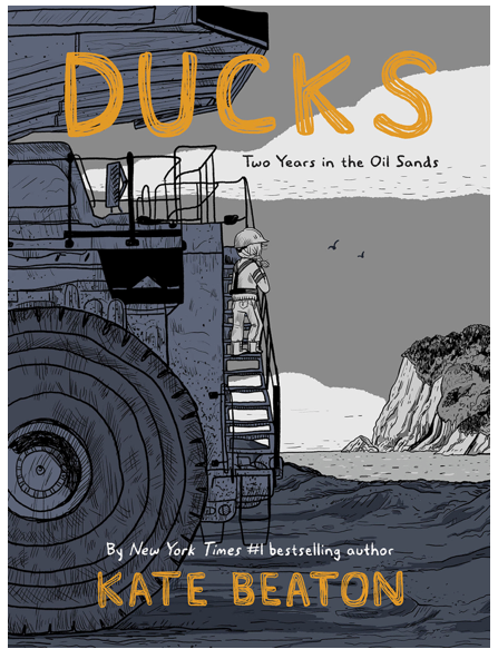
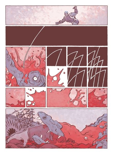
Ducks: Two Years In the Oil Sands by Kate Beaton, published by Drawn & Quarterly (reviewed here)
Beaton puts herself out there in this book, examining two years of her life when she worked in the Canadian oil sands and experienced a life that was designed to tear people down instead of building them up. Maybe that’s why it’s taken her nearly 20 years to tell this story. Beaton is just very honest in this book, showing an ability to explore her personal past while presenting it in an open and universal way that allows the readers to see themselves in some aspect of her story. It’s very personal, examining her ordeals and traumas while revealing these breakdowns in the very systems that are supposed to be supporting her.
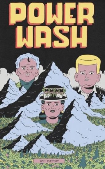
Goiter 7, Power Wash by Josh Pettinger, self-published
I don’t think there is a cartoonist who captures the modern condition any better than Josh Pettinger. He continually impresses with his ability to evoke a general sense of paranoia via stories that are just that side of the absurd. I’m not sure what makes Power Wash distinct from a normal issue of Goiter, as most of what occurs in Power Wash is introduced in the more recent issues of Goiter. Pettinger seems to have connected with the development of Tedward, a character who suffices to a definition of charmingly cringeworthy(?). These two issues also both feature installments of Victory Squad, a more direct, or perhaps broader satiric offering that peels layers of consumerism apart. Overall, Pettinger can’t help but evoke an “on-edge” feeling with his comics - each choice seems designed to poke the reader just off-center. The end result is a contemplative feeling, but one without any firm resolution. (mmc)
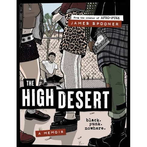
High Desert: Black. Punk. Nowhere. by James Spooner, published by Harper Collins
I likely will not be able to explain how I feel about this book in a way that will actually do it justice. High Desert is one of the most fully-formed books I read all year, and I was stunned to realize it is James Spooner’s official debut. Now, to be fair, Spooner has published some zines, and he’s also famous for the exceptional Afro-Punk documentary, so it’s not exactly like the dude came out of nowhere. But the fact that his storytelling prowess comes across with such thoughtfulness of the paneling and structure of each page, the idea that he has a command of facial gestures in such a way that they capture whole paragraphs of thought, and the way he is able to interweave personal reflection with an account of events without feeling over editorial or pedantic is downright stunning. High Desert is a book that functions on numerous levels. It’s a fantastic snapshot of the 90s punk and hardcore scene that causes me to reminisce almost every page. But triumphs as a beautifully personal account of growing up black in what is arguably the dominant white subculture - suburban punk rocker. Spooner’s genius is his ability to access all layers of his account. It’s a personal memoir, a beautiful individual story, while also being an account of the hypocrisy of the punk movement in the eyes and thoughts of a person of color. But ever for a basic white dude like me, it feels like a transcendent message about adolescence as a whole. Spooner captures the loneliness of the punks, goths, and hardcore kids in High Desert - the overwhelming feeling of being ostracized that caused so many of us to reach out to the world of punk rock in the first place. But the genius of Spooner’s account - and what I think hammers home its authenticity - is the way he is able to articulate the feeling when that safe haven still conjures those came feelings of othering. High Desert is a superb book and belongs on the shelf next to the likes of Our Band Could Be Your Life, Get in the Van, and American Hardcore. (mmc)
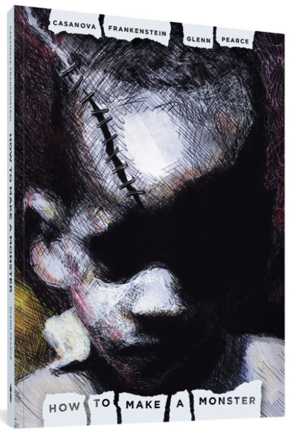
How to Make a Monster by Casanova Frankenstein and Glenn Pearce, published by Fantagraphics Books (reviewed here)
This was the last thing that I wrote about in 2022 and it won me over just by how close the childhood shown here was to my own. I was able to see things in Frankenstein’s story that quite literally spoke to me in terms of experience and feelings, which I loved. And I also appreciated the differences in our stories, where while I recognized the events, I didn’t live with the same fear that he did. To me, this was the experience of the contrasts in our lives, where things were the same and where they were different. And Pearce drew a wintry south-side Chicago that felt both alien and comfortably recognizable. It was weird how we captured that soul-numbing chill of those winter days.
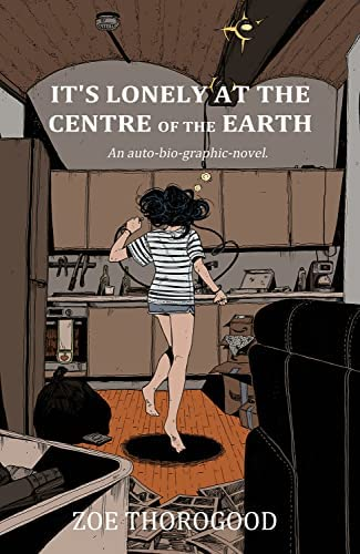
It’s Lonely at the Centre of the Earth by Zoe Thorogood, published by Image Comics
Holy moly. Zoe Thorogood’s six-month memoir heavily focuses on the pressure, anxiety, and emptiness following the publication and critical success of The Impending Blindness of Billie Scott. It was hard not to interpret Impending Blindness with some autobiographical notes, but in Centre of the Earth, Thorogood pulls back the curtain entirely and bares her soul, ostensibly to cover a six-month period of intense depression simultaneously fueled by and contributing to extreme self-doubt. The honesty is as brutal as it is touching and reassuring. Thorogood’s ability to be self-deprecating without entirely deflecting is an art in and of itself. For those of us who read Impending Blindness and found Zoe Thorogood to have arrived to us fully formed as a genius cartoonist have to admit we were a little wrong in that Zoe has so much more to offer than we first considered. Her cartooning takes a giant step forward. Her ability to experiment with the form serves to both drive the non-linear components of the narrative while also allowing her to explore different aspects of herself. There is almost a free-verse feel to the book which serves both the feeling of unencumbered, unedited honesty and the idea that this book is very much one of stanzas, of little moments and snippets that compile into a harrowing year. (mmc)
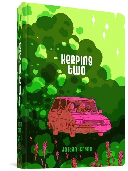
Keeping Two by Jordan Crane, published by Fantagraphics
We’re borderline overrun by cringeworthy material bent on eliciting some sort of ironic detachment-laden humor, but Keeping Two is a book I felt in my gut as I read it for different notions of discomfort and embarrassment. Rather than the purely cringe, Keeping Two hits the reader with a terribly precise depiction of the mundane ugliness of life. Keeping Two chronicles a mere few hours in the life of a young couple trying to remember why they love each other amidst of a simple series of everyday obstacles. There is nothing here that is particularly tragic, and yet that makes the whole endeavor feel that much more tragic. Keeping Two is rut personified, with a level of honest precision that had me grimacing as I was reminded of my own inconsiderate pigheadedness. Woven together with a parallel story, a literal short story the couple is reading together, Crane interjects little winks at the surreal that serve to interrupt the timeline of the main narrative and provide both a metaphor and a commentary on the main story. It’s a tight story considering it takes hundreds of pages to investigate the fallout of a fight that lasts a few hours at most. (mmc)
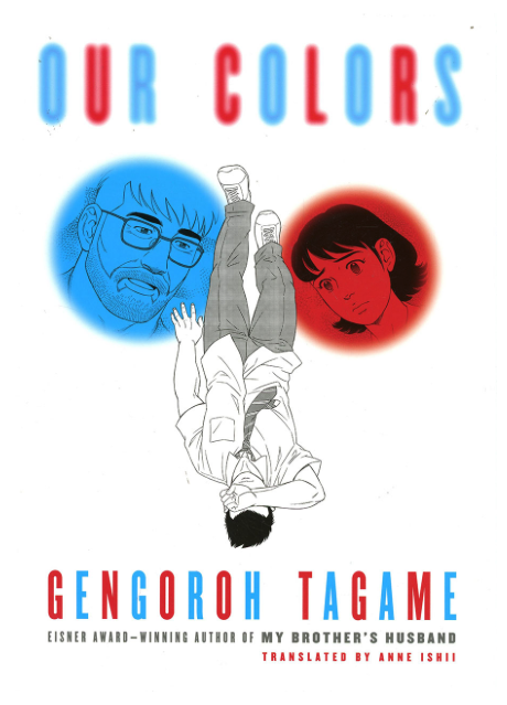
Our Colors by Gengoroh Tagame, published by Pantheon Books (reviewed here)
Kind of like Frankenstein and Pearce above, Tagame has a way of creating empathy in his audience, but not just for the main characters. In this tale, Sora is a young man struggling with his own queerness in a very conservative Japan, Tagame is probably bringing his own experience to the story. But as the audience, he also puts us in the position of the family, the friends, and the outsiders who are struggling to accept and understand Sora. He gives us this insight into a struggling young man’s emotions while also making us ask how would we respond to Sora.
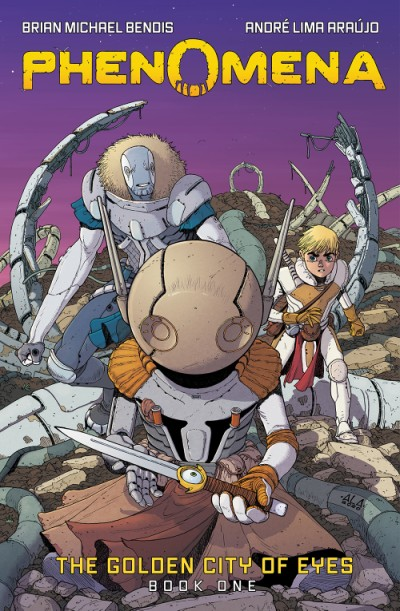
Phenomena: The Golden City of Eyes by Brian Michael Bendis and André Lima Araújo, published by Abrams Comicarts
Phenomena is hands down the best genre book I read all year. I was absolutely stunned by how tightly constructed and driven this book is. Bendis creates a fascinating world and he manages to take a step back and allow Lima Araújo’s artwork to function as the core component of the narrative structure while also leaving the reader with enough mystery about the world of the Golden City. For all his ability to mine characterization, Bendis always seems compelled to contextualize his plots, but here he seems to let the world exist. It’s cleaner, and it’s far more engaging as a result. And really, André Lima Araújo’s line work is an excellent complement. This year, Lima Araújo also produced A Righteous Thirst for Vengeance with Rick Remender. But his work on Phenomena feels clearer and softer, and it looks beautiful in black and white, a choice that both connotes the obvious Shonen manga as well as 80s indie comic influences. Lima Araújo conjures a sublime style, one that feels part Miyazaki, part Moebius. (mmc)
Prime/Drome by Jesse Lonergan, self-published on Patreon, newsprint.
Jesse Lonergan is my favorite science fiction storyteller working in comics today. He succeeds in capturing an aesthetic that hearkens back to both pulp magazine cover art and 70s underground comics. When I read a Jesse Lonergan story, there is a timelessness to it. I feel continually mesmerized by his layouts - the geometry of his pages alone is enough to induce a trance state. In an era in which science fiction comics are often overly glitzy, Lonergan’s raw feel is a welcomed change. Steeped in the traditions of science fantasy, Prime/Drome is an example of how to do long-form storytelling without relying on needless re-explanations of the exposition, an insistence upon setting up the background for every event, or the use of incessant dialogue to advance the plot and provide overloaded context. Lonergan has always known how to pull back and let the page speak for itself. His gridded process gives the levels of detail better than any wedged-in dialogue ever could. And Della is a badass, through and through. (mmc)
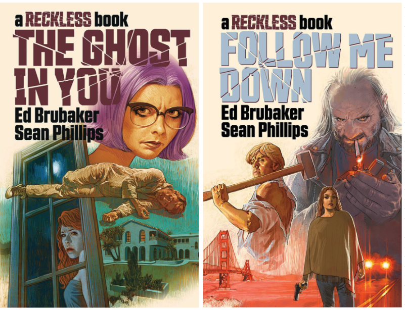
Reckless: The Ghost in You & Reckless: Follow Me Down by Ed Brubaker and Sean Phillips, published by Image Comics.
I’m not really that keen on the first three Reckless books. They were fine but lacked any real emotional gut punch that the best Brubaker/Phillips collaborations do. And to be fair, that statement applies to most of the non-Criminal books by the two as that work often feels more like exercises in storytelling than trying to convey something real or meaningful (except for Pulp, which remains excellent.) But these last two Reckless books, which go together as they cover the same time period from two different viewpoints, are simply fantastic. In the first book, putting the spotlight on Anna, Ethan’s girl Friday in this series, opens up the emotional space in the book. And while Follow Me Down is back to being focused on Ethan, it kind of helps knowing that he’s not the center of this world and there’s room for other, more developed characters to move and affect Ethan. Sean Phillips and Jacob Phillips capture this California ennui in the characters, in the location, and in the lighting that defines the space that these characters exist in.
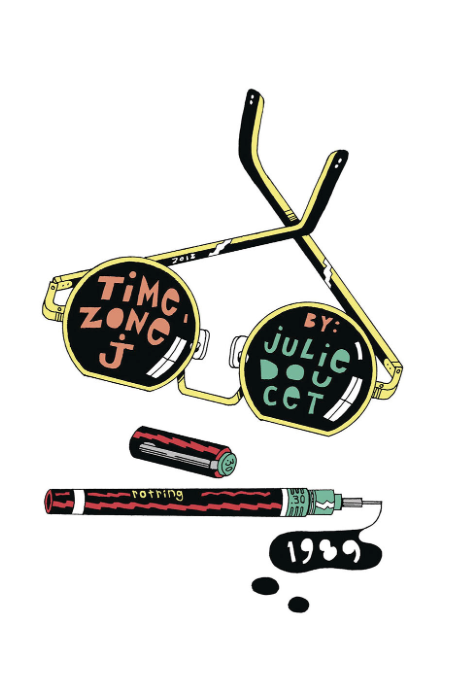
Time Zone J by Julie Doucet, published by Drawn & Quarterly (reviewed here)
The art from this book is what will haunt me for a long time, page after page of facesjust all intermingled on the page, creating this barrier for the cartoonist to hide in as she tells us about a failed romance from her youth. Each page is more of the same but so different than what came before it, creating this nearly endless scroll through Doucet’s memories. As I wrote in my review back in May, it’s like being at a party, tightly packed together in a room with a ton of people but focusing on only what one of them is saying as her words cut through all of the other clatter.
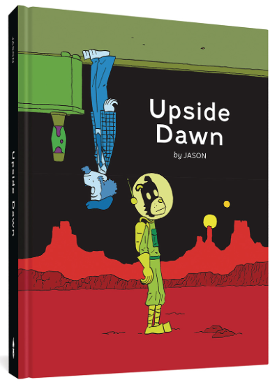
Upside Dawn by Jason, published by FantagraphicsIt’s been a few years since Jason’s books have really made that much of an impact but Upside Dawn is one of the most inventive and fun books that he’s put out in a long time. A collection of short, absurd, and often funny stories, Jason is playful in these stories. His quirky storytelling set him apart years ago but in many ways in the past 10 or so years, it feels like it has become a brand to be managed instead of a direction to be explored. The stories in this book tap into that inquisitive nature again as we see the cartoonist really pushing the idea of what a story is and what needs to be there and what needs to be cut out as he really plays with structure in ways that few cartoonists do.
Honorable Mentions:
There are plenty of other comics I enjoyed this year. Metax made me think more than any other book, and if I had the chance to re-read it and write about it, it likely would have ended up on this list as well. M is for Monster is also deserving of more consideration and is one of the better young-adult graphic novels I’ve read in recent times mostly because it allows itself to be its own book without twisting to fulfill every YA trope. 20th Century Men has some of the biggest ideas of any mainstream book out there. It feels like a throwback to early 10s Image Comics, and it makes me yearn for more floppies that try to tackle big concepts. Alas, I’m three or four issues behind. Ram V is solid in everything he does, but he and Mike Perkins are other level with The Swamp Thing. The only downside is that the book needs another 30 issues to do it justice - talk about big ideas in a small package. I enjoyed Birds of Maine, but I struggled with the D&Q version. I understand the inclination to keep each entry the size of the original Instagram post, but I feel like the whole point of publishing a book would be to expand the size of the original cartoons. I guess it would have been a long book, but that’s not a problem, right? (mmc)