5 Details That Jumped Out In Comics I Read This Week- 6/9/2026.

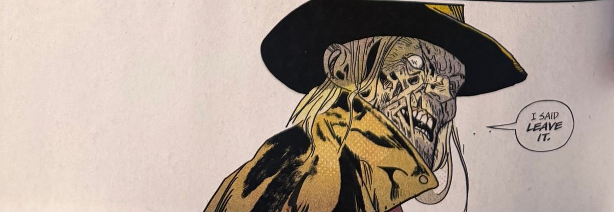
I read a lot of comics this week. Here are a handful of small things in different books that really jumped out at me.
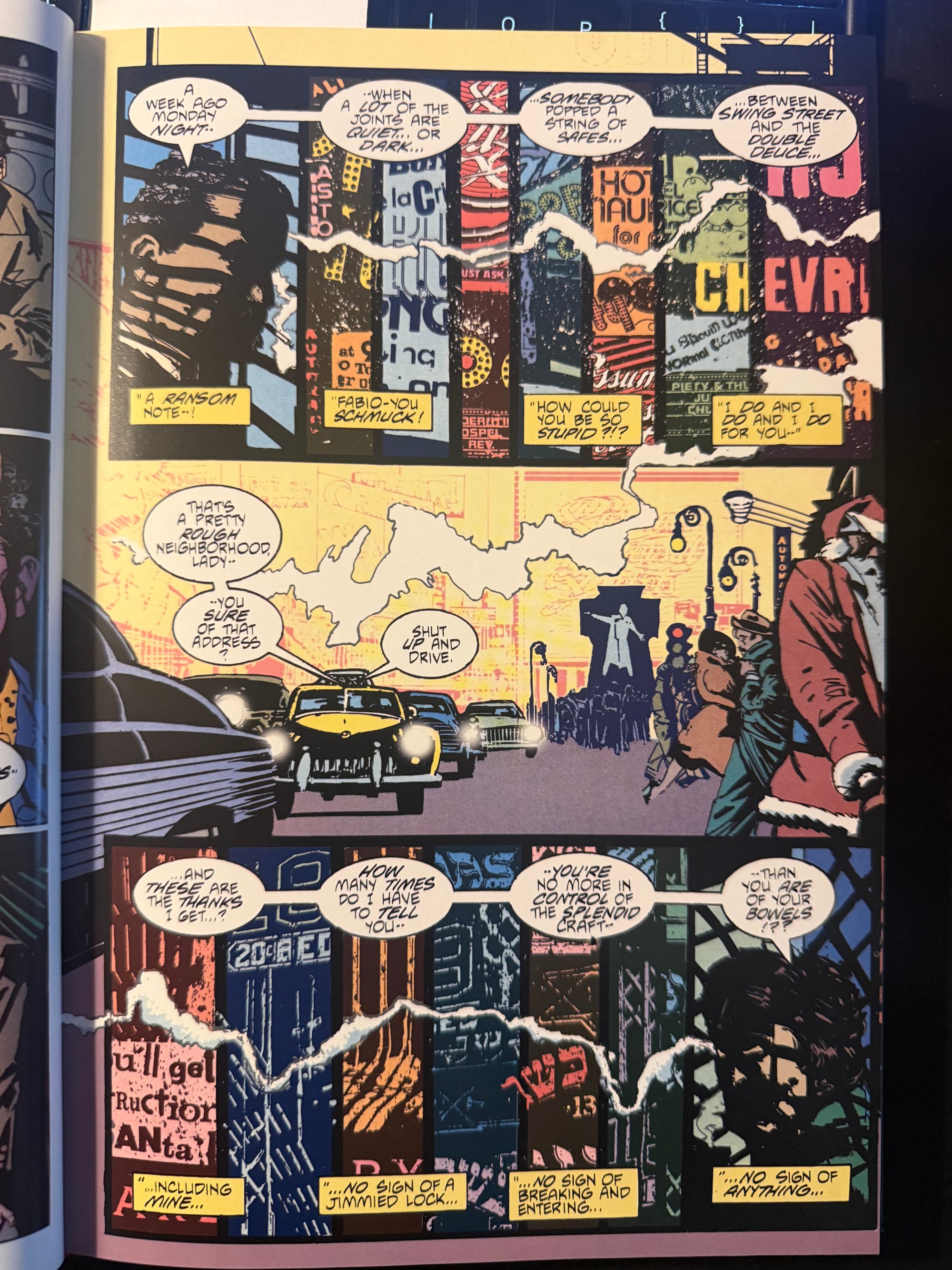
From Time2 Omnibus by Howard Chaykin, Ken Bruzenak, and Linda Lessmann (2022, Image Comics)
Howard Chaykin’s Time2 is a series that I often come back to. This particular page is from The American Flagg! Special (1986) and one of the things that still excites me about this work is the way that Flagg and Bruzenak structure the pages. There’s two different dialogues working through this page— Cosmo Jacobi and Aunt Rose DaSilva. Everytime I get to this page, I just remember that initial confusion— Cosmo’s dialogue starts on the top row of panels describing the events of a week ago. But underneath it, in the caption boxes, there’s another conversation happening. And then in the bottom tier of panels, practically a mirror of the top tier, Aunt Rose berates her nephews while a different conversation takes place in the caption boxes.
Maybe 16 year old me just wasn’t visually literate enough to get what Chaykin and Bruzenak were doing here and didn’t pick up that the caption boxes were the other conversations, a great way to show these conversations happening simultaneously. But I get to this now and the playfulness of this page just stops me in my tracks, seeing how these creators uses the structure of the page to express more than just a linear representation of this story, A to B to C. Instead, this is A/B/C (C being the middle tier) to compress time and even space here.
I picked up this omnibus off the shelf this week, kind of wondering why I like Time2 (and Howard Chaykin) so much and this page reminded me of why— it’s the creativity and the ambition that’s there on the page.
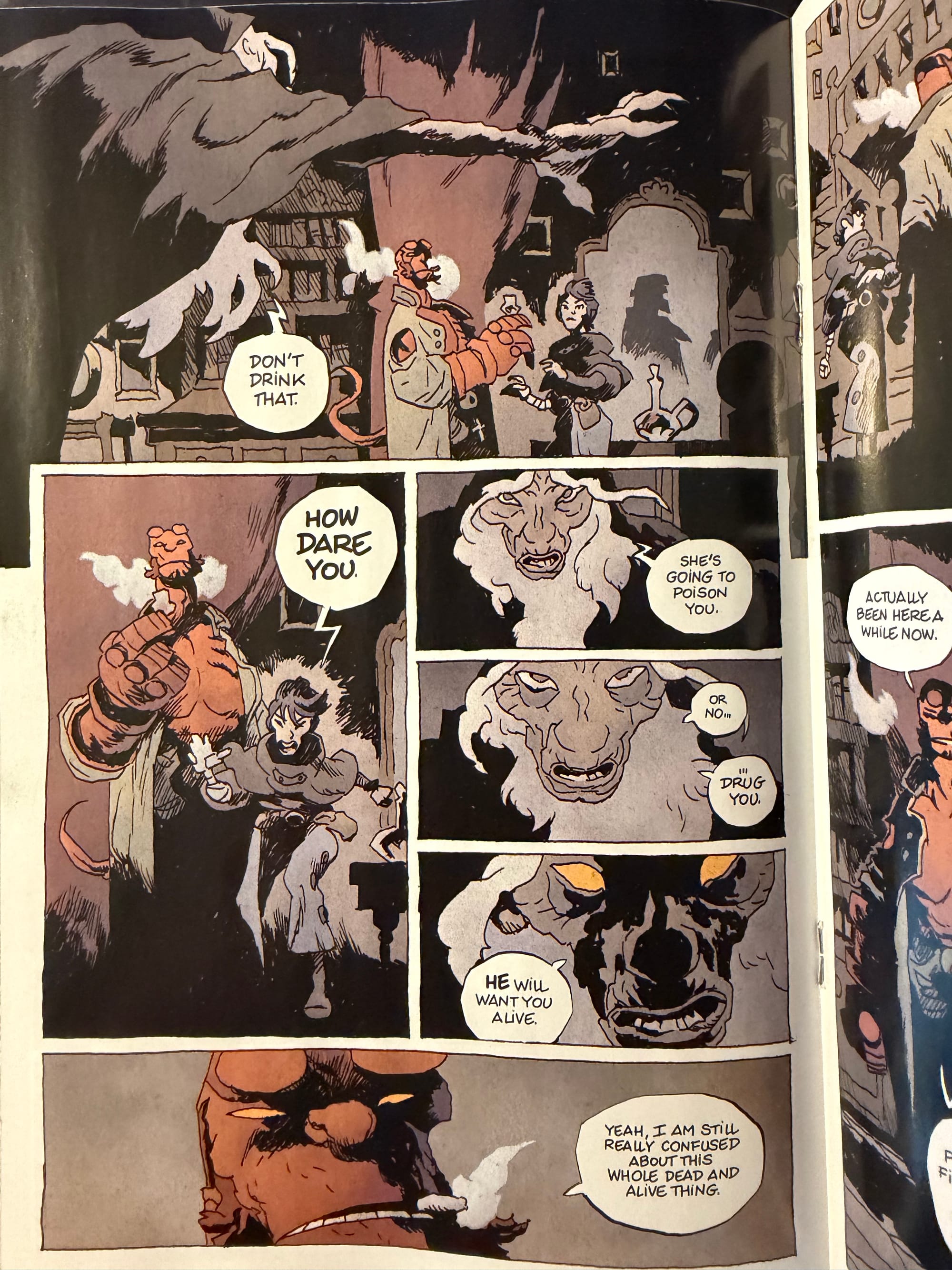
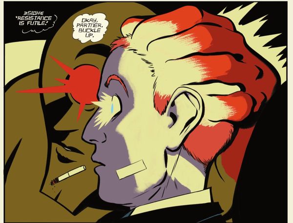
From Hellboy In Hell: Nothing But Blood by Mike Mignola, Cyrille Pomés, & Dave Stewart (2026, Dark Horse Comics)
Other than when it’s the first person pronoun, Cyrille Pomés draws out the letter “i” as the lower case “i” throughout this comic. No other letter in the comic gets the lower case treatment, just “i.” And looking through his Instagram page, it seems that Pomés does this regularly in his comics.
It’s a small detail but a fascinating one. Pomés lettering is distinctly French, coming from a long line that goes back to a lot of the lettering in Moebius’ comics. I don’t know whether that lower case “i” is a French thing but once I spotted it in the is comic, I couldn’t not see it. And it’s fun because it’s not a distraction but had me paying so much more attention to the lettering than I normally would have.
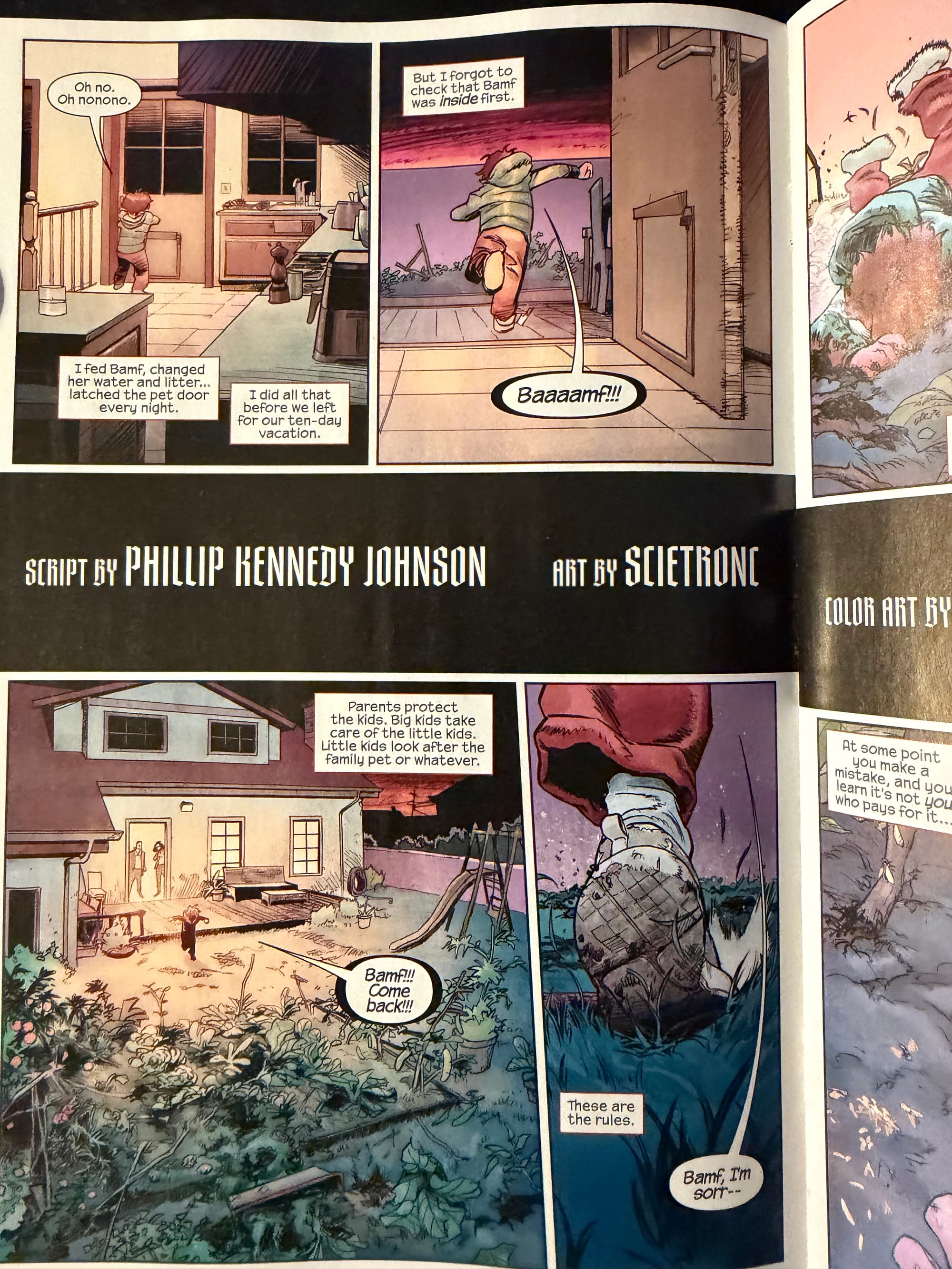
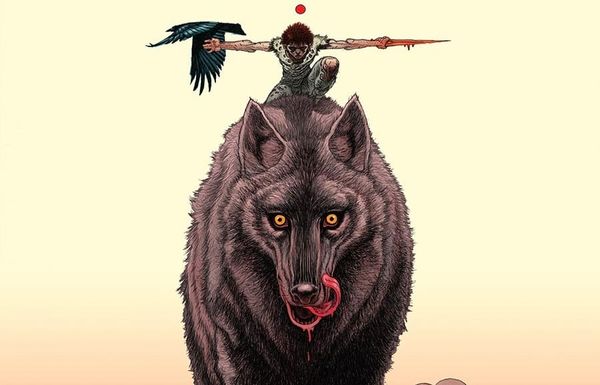
From Midnight Spider-Man #1 by Phillip Kennedy Johnson, Scietronc, Neeraj Menon, & Joe Caramanga
Another French artist even if Scietronc’s work in this getting mostly compared to manga. What caught my eye here is something that I didn’t notice until I watched a YouTube video reviewing the initial release of the Midnight books— the chicken scratch on the door in panel 2. It’s the horizontal scratching on the short side of the door that really doesn’t have anything to do with the door. It may be shading but it’s weird shading. But it’s a nice little indication of how this book colors outside of the lines (so to speak.) Compare this to the cleanliness and tidiness of the recent Ultimate Spider-Man series and already by the second page, we can see that this book is nothing like the last big publishing swing that Marvel took.
That door is just messy in an unexplainable way. Those lines look more like string or stubble which would be completely out of place here. It’s a small detail, practically nothing in the larger scheme of this issue but it speaks to the character of the artwork and sets this whole thing up to be a messy story (a good messy, not a bad one.)
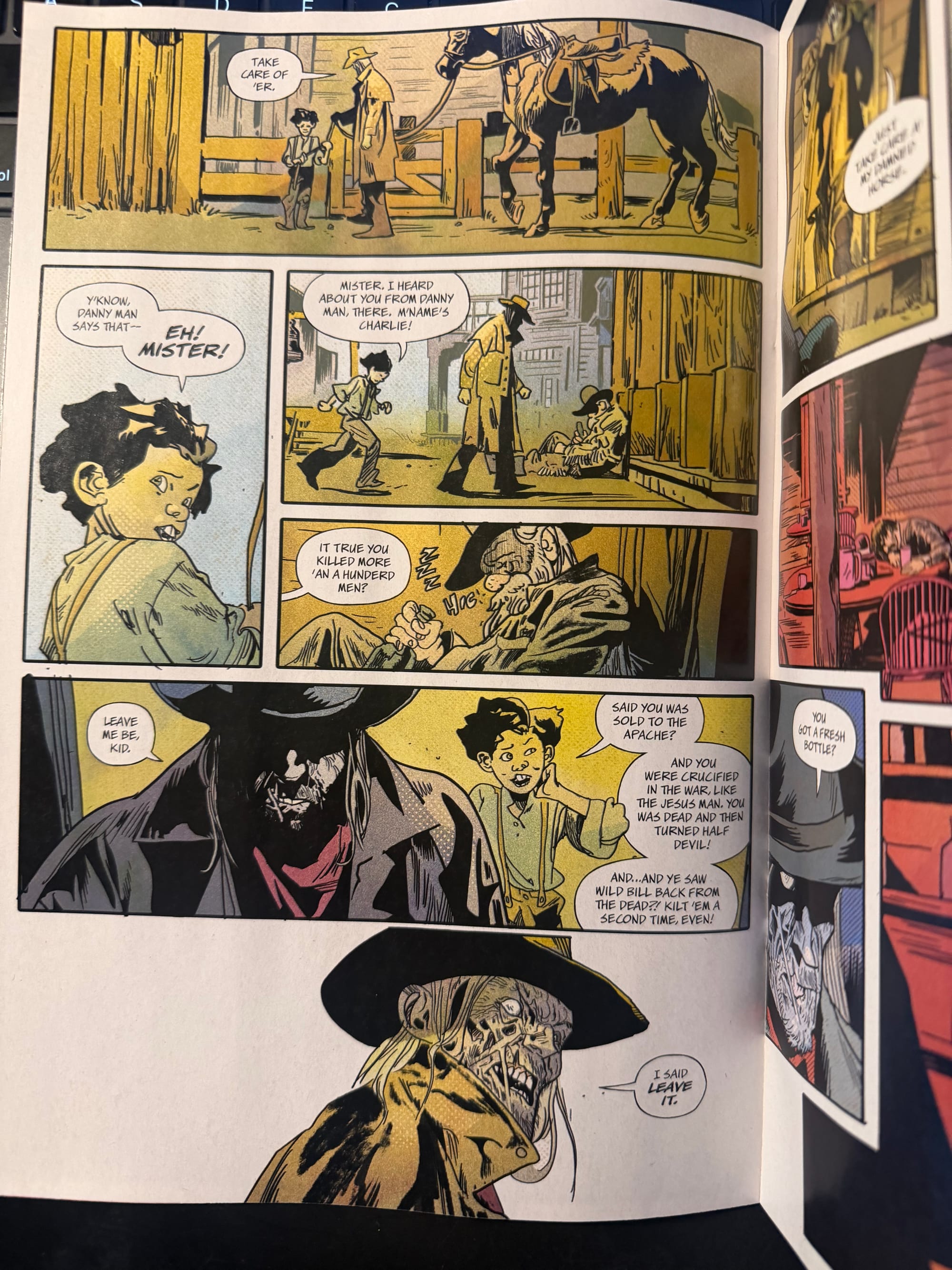
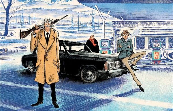
From Jonah Hex and the Shadow of Death #1 by Michael Walsh, Toni-Marie Griffin, & Becca Carey (DC Comics, 2026)
Toni-Marie Griffen’s coloring over Michael Walsh’s is breathtaking in just how dusty and almost broken down it is. By taking down the saturation, Griffin adds a haziness to this neo-western, giving it a dreamlike quality— not quite a nightmare but definitely not a good dream.
And in this page, I like the references to Wild Bill and Hex’s storied past, where the legend may be more than the man. I wonder if Walsh or DC would be brave enough to put a Winter Brothers reference somewhere in this series?
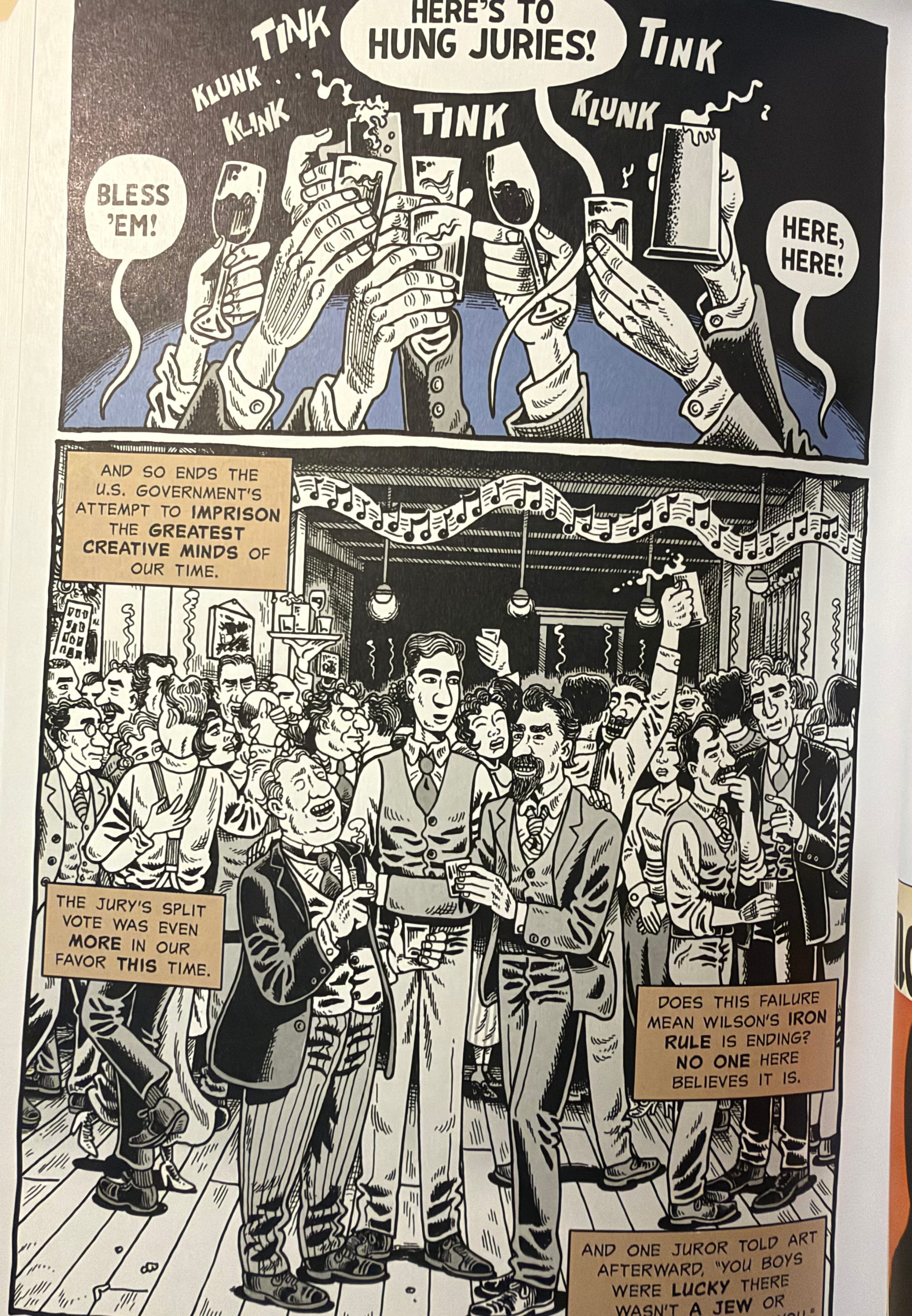
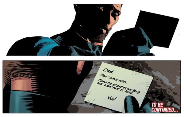
From The Dissidents by Derf Backderf (Abrams Comic Arts, 2026)
Speaking of coloring, I was surprised to see color used sparingly (if at all) in Derf Backderf’s The Dissidents. I’m used to thinking of his stuff as black & white so just the occasional uses in his new book, which is largely black & white, are just these tasty little points in the series. I don’t know how much these moments do because they are so few and far between but even just flipping through the book, they’re eye catching and make you stop for a brief bit and linger in the panel.
The Dissidents is a captivating book, highlighting a period of cartooning that's not well known now but feels like it's so foundational to what we see happeing in cartooning (and the world) now.
Thank you for reading From Cover to Cover.
Click here to receive new posts in your email and support our work through a tip at Ko-Fi.