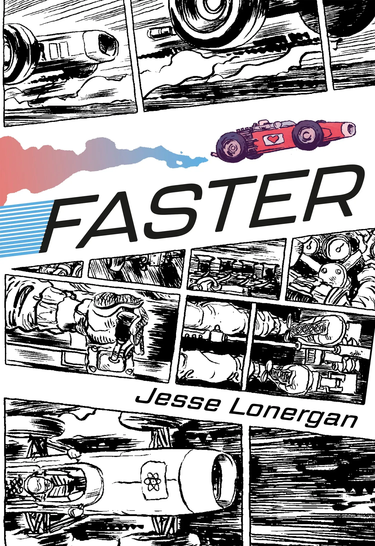

Comics at 120MPH-- thoughts on Jesse Lonergan's FASTER
As he builds his pages in Faster, you need to pay attention to where Jesse Lonergan zigs in his storytelling when you expect him to zag.

Jesse Lonergan obviously loves the comic page. Maybe that’s something to say about an artist, but in too many comics, the page and its panels seem more like containers— part of the language of comics, and that language has largely become tired and staid. The language of comics has calcified as new artists have imitated imitators or imitators of imitators. We’re so far removed from the artistic innovators of comics that it’s hard to find any spark in the visual storytelling (hard, but not impossible). So when something like Lonergan’s Faster pops up on your radar, his love of the comic page is infectious.
Lonergan spins a tale of auto racers Kona Demille (5x World Champion,) Molly Vox (5x runner-up), and the big race at the Bonzo International Speedway. It’s a fast-paced (pun only slightly intended but still apt description) story about these rivals and the rest of their competitors as they all race toward the finish line. The race and the whole plot around it feel less like the reason for the comic as they exist to serve the dynamic artwork and storytelling. Come for a racing story but stay for the artwork to carry you away into this exciting way to experience the speed and g-force in static images.
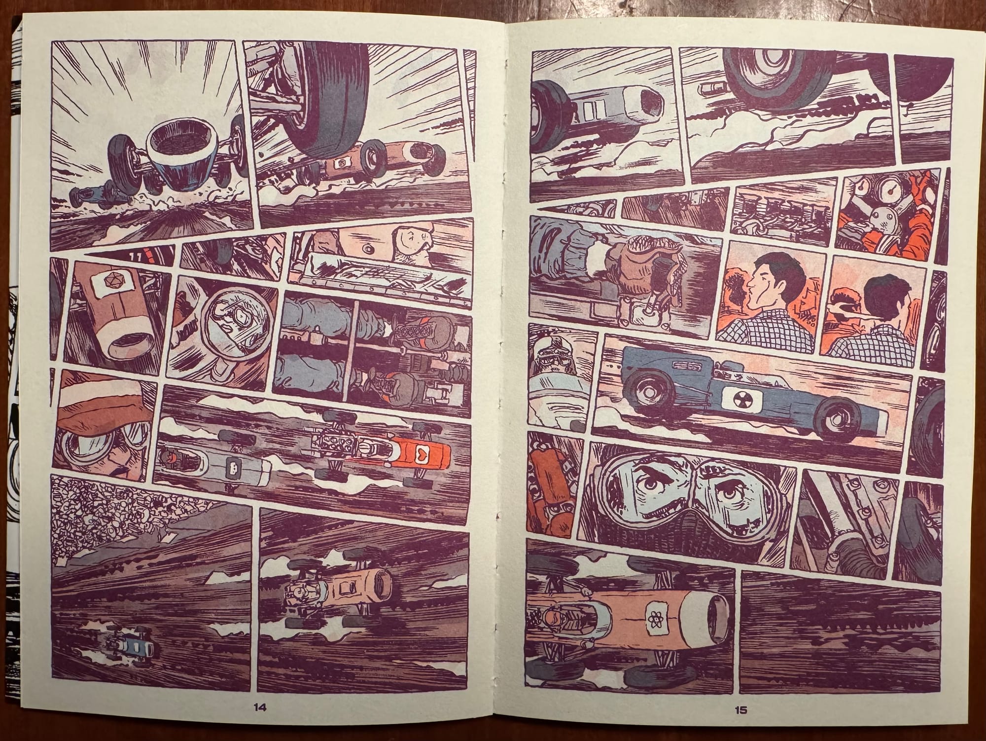
When Lonergan is drawing the race, you can see how every panel, the framing of each image, the tilt of the panel, and even the colors draw your eye through the story. Here Lonegran is sculpting time through the page, pulling at it like taffy to manipulate it and our experience of it. The sequence above keeps your eye darting through it. This is a two-page spread that’s easy to read; the tiers of the page create three distinct phrases— the top and bottom tiers focusing on the speed and energy of the car race. And then in between the cars, these quick, staccato panels focus in on the races, still maintaining the speed and velocity of the race but bringing them down to the human element of the race— the drivers and spectators trying to keep up with all of the action. Lonergan pulls us into the story on this page, caught up in all of the action and drama of the comic.
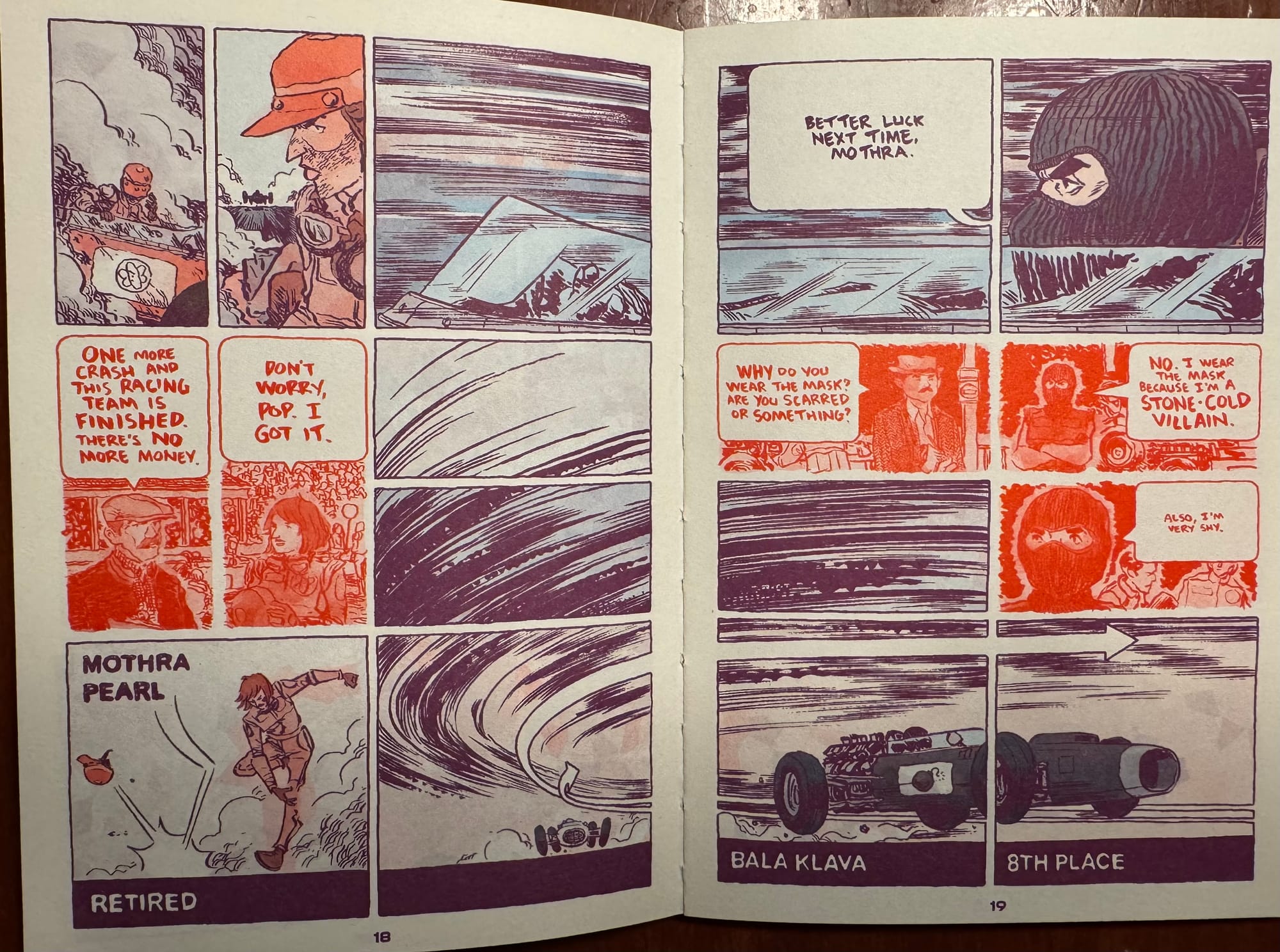
As he builds his pages in Faster, you need to pay attention to where Lonergan zigs in his storytelling when you expect him to zag. Pages 18 and 19 stick us right behind the steering wheel of the cars but then he pulls us briefly out of the race with the red panels that take us to the moments before the race— the desperation and the aloofness of the racers that make the race all the more thrilling. This isn’t necessarily a story about the racers but Lonergan finds the space in the story to give us these small little personal insights into the racers to make them more than just NPCs in this story. These red panels become a signifier throughout the book that we’re stepping into an aside without ever breaking up the flow of the race.
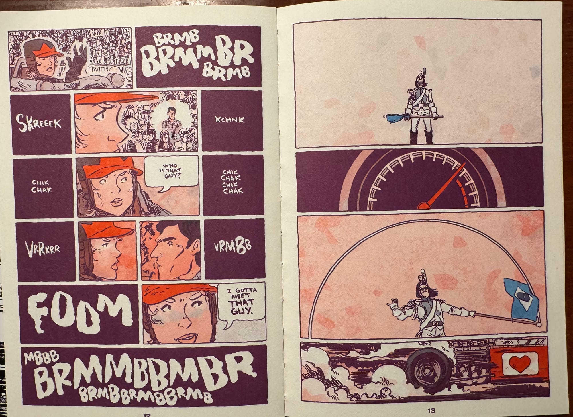
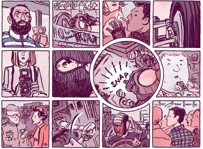
Lonergan knows that the comic page is more powerful than just being a storyboard, just moving us forward a little bit in time with each panel. The page is a living, breathing thing and even as we’re moving through time, we’re moving through space, emotions, and sensations. You can go from a page that’s a fairly literal pre-race moment that still communicates the mounting tension through sound effects that amp up the rumble of the engines, to a page that’s fairly abstract storytelling, repeating circles and stretching out the wave of the starters flag over the whole page, honestly maybe my favorite page of the book. The way that Lonergan pulls in and out of the page, repeating the curved shape of the wheels in three of the panels, creates a pulse to this story. It’s not a literal moment-to-moment page but more of a statement to prepare us for race.
This comic reads like a love letter to comics, a statement, and a reminder of how art can make us feel something on each and every page. There’s a raw and primal quality to the storytelling here, something that connects to the reader that is so rare to find in comics. On each page, Lonergan gives way to the moment, boiling it down to the key elements that the story needs. Sometimes that’s an open page with just a few panels that gives us a moment to slow down in the story and take everything in. Other times, it’s a two-page spread packed with panels, practically pelting us with images but never overpowering our ability to read the scene or sequence. Faster is a love letter- a love to art, storytelling, and comics.